Angular Stepper Component Overview
The Ignite UI for Angular Stepper is a highly customizable component that visualizes content as a process and shows its progress by dividing the content into successive steps. It appears as a vertical or horizontal line. Provided by the Ignite UI for Angular Component library, the stepper component delivers a wizard-like workflow and multiple features like step validation, styling, orientation and keyboard navigation.
Angular Stepper Example
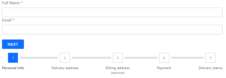
In this Angular Stepper example, you can see how users are given the opportunity to customize their credit card and they pass trough the process in five logical steps - selecting card type, adding business information, filling in personal information, providing shipping details and confirmation. Note that the fourth step in our Angular stepper demo gets enabled only if the user ticks the checkbox in the second step, signifying that their mailing address is different from the business physical address.
Here is the a sample demonstrating how to achieve the above functionality using Angular Reactive Forms.
Getting Started with Ignite UI for Angular Stepper
To get started with the Ignite UI for Angular Stepper component, first you need to install Ignite UI for Angular. In an existing Angular application, type the following command:
ng add igniteui-angular
For a complete introduction to the Ignite UI for Angular, read the getting started topic.
The next step is to import the IgxStepperModule in your app.module.ts file.
// app.module.ts

...
import { IgxStepperModule } from 'igniteui-angular';
// import { IgxStepperModule } from '@infragistics/igniteui-angular'; for licensed package

@NgModule({
    ...
    imports: [..., IgxStepperModule],
    ...
})
export class AppModule {}
Alternatively, as of 16.0.0 you can import the IgxStepperComponent as a standalone dependency, or use the IGX_STEPPER_DIRECTIVES token to import the component and all of its supporting components and directives.
// home.component.ts

import { HammerModule } from '@angular/platform-browser';
import { FormsModule } from '@angular/forms';
import { IGX_STEPPER_DIRECTIVES } from 'igniteui-angular';
// import { IGX_STEPPER_DIRECTIVES } from '@infragistics/igniteui-angular'; for licensed package

@Component({
    selector: 'app-home',
    template: `<igx-stepper>
        <igx-step>
            <p igxStepTitle>Step 1</p>
        </igx-step>
        <igx-step>
            <p igxStepTitle>Step 2</p>
        </igx-step>
    </igx-stepper>`,
    styleUrls: ['home.component.scss'],
    standalone: true,
    imports: [IGX_STEPPER_DIRECTIVES, FormsModule, HammerModule]
    /* or imports: [IgxStepperComponent, FormsModule, HammerModule] */
})
export class HomeComponent {
    public task: Task;
}
Now that you have the Angular Stepper module or directives imported, you can start with a basic configuration of the igx-stepper and its steps.
Now that you have the Angular Stepper module or directives imported, you can start with a basic configuration of the igx-stepper and its steps.
Using the Angular Stepper
IgxStepComponent is the representation of every step that belongs to the IgxStepperComponent. Steps provide isValid, active, optional, disabled and completed properties, which give you the ability to configure the step states according to your business requirement.
Declaring a Stepper
Now that we have the stepper module imported, let’s get started with its configuration.
Steps can be declared using one of the following approaches.
- Iterating through a data set
<igx-stepper>
    <igx-step *ngFor="let step of stepsData" [disabled]=”step.disabled”>
        <igx-icon igxStepIndicator>
			{{step.indicator}}
        </igx-icon>

        <p igxStepTitle>
			{{step.title}}
        </p>
    </igx-step>
</igx-stepper>
- Creating static steps
<igx-stepper>
    <igx-step>
       <p igxStepTitle>Step 1</p>
    </igx-step>
    <igx-step>
       <p igxStepTitle>Step 2</p>
    </igx-step>
</igx-stepper>
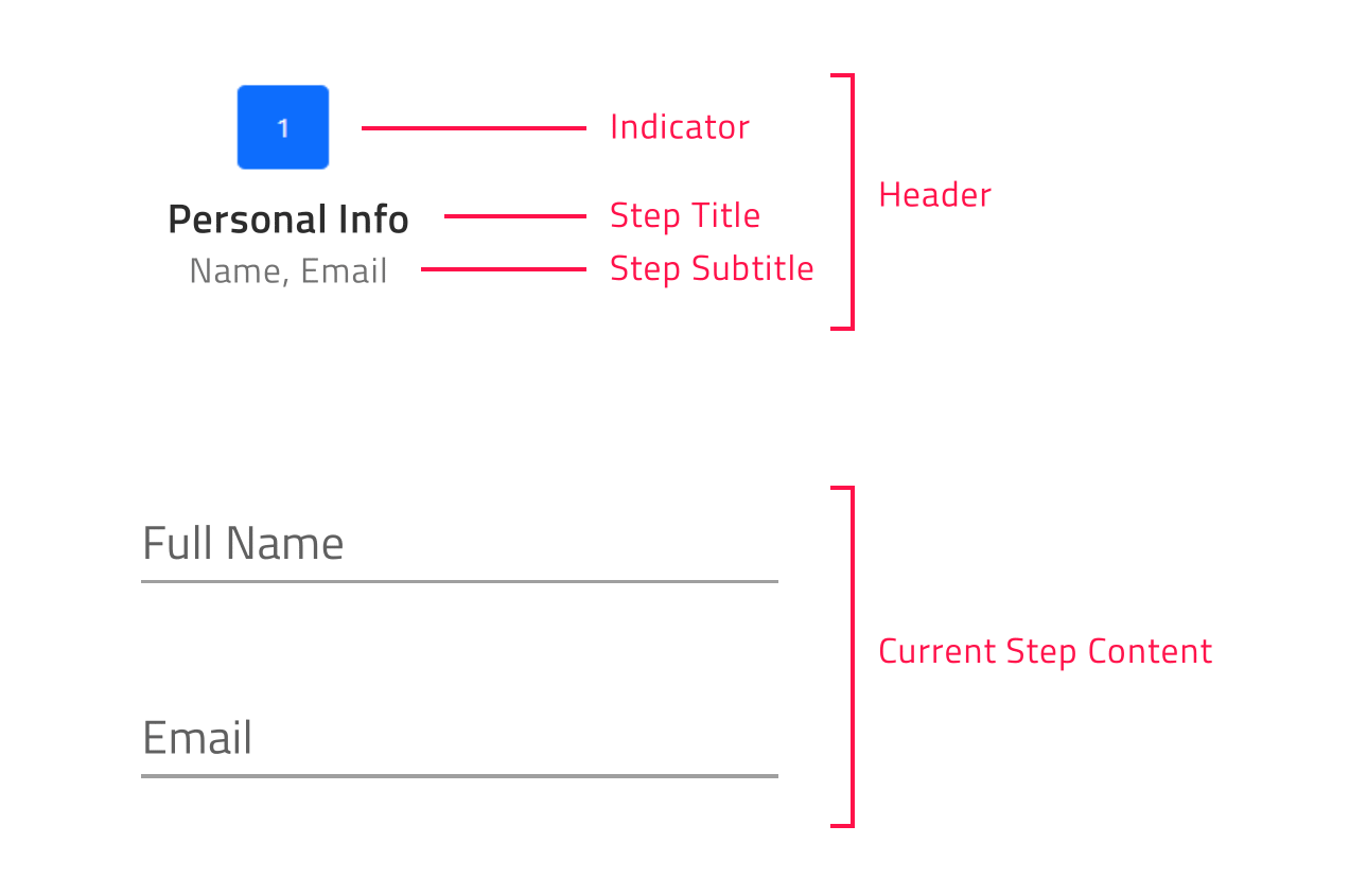
For each step the user has the ability to configure indicator, title, subtitle and content using the igxStepIndicator, igxStepTitle, igxStepSubtitle and igxStepContent directives as follows:
<igx-stepper>
    <igx-step>
       <igx-icon igxStepIndicator>home</igx-icon>
       <p igxStepTitle>Home</p>
       <p igxStepSubtitle>Home Sub Title</p>
       <div igxStepContent>
          ...
       </div>
    </igx-step>
</igx-stepper>
Changing the Stepper Orientation
You can customize the stepper orientation through the exposed orientation property. It takes a member of the IgxStepperOrientation enum - Horizontal (default value) or Vertical.
Horizontal Stepper Orientation
horizontal is the default value for the igx-stepper orientation property.
When the stepper is horizontally orientated you have the opportunity to determine whether the steps’ content would be displayed above or below the steps’ headers. This could be achieved by setting the IgxStepperComponent contentTop boolean property, which default value is false. In case it is enabled the steps’ content would be displayed above the steps’ headers.
Vertical Stepper Orientation
You can easily switch from the horizontal to vertical layout. In order to change the default orientation you should set the orientation property to vertical.
<igx-stepper [orientation]="'vertical'">
	<igx-step>
  		…
	</igx-step>

	<igx-step>
 		 …
	</igx-step>
</igx-stepper>
The sample below demonstrates how stepper orientation and titles position could be changed runtime.
Step States
IgxStepperComponent supports four steps states and each of them apply different styles by default:
- active - Determines whether the step is the currently displayed. By design, if the user does not explicitly set some step’s active attribute to
true, the initial active step would be the first non-disabled step. - disabled - Determines whether the step is interactable. By default, the disabled attribute of a step is set to
false. - optional - By default, the optional attribute of a step is set to
false. If validity of a step in linear stepper is not required, then the optional attribute can be enabled in order to be able to move forward independently from the step validity. - completed - By default, the completed attribute of a step returns
false. The user, however, can override this default completed behavior by setting the completed attribute as needed. When step is marked as completed not only that the style of the step header is changed by default, but also the style of the progress line between the completed step and the next one. Both styles could be modified using the exposed CSS variables.
The IgxStepperComponent gives you the opportunity to set validation logic for each step through the two-way bindable isValid property. Based on its value it is decided whether the user will have the ability to move forward in linear stepper mode.
By default, the isValid property of a step is set to true.
Linear Stepper
The igx-stepper gives you the opportunity to set its steps flow using the linear property. By default, linear is set to false and the user is enabled to select any non-disabled step in the IgxStepperComponent.
When the linear property is set to true, the stepper will require the current non-optional step to be valid before proceeding to the next one.
If the current non-optional step is not valid you cannot go forward to the next step until you validate the current one.
Note
Optional steps validity is not taken into account in order to move forward.
The following example demonstrates how to configure a linear stepper:
Step Interactions
IgxStepperComponent provides the following API methods for step interactions:
- navigateTo – activates the step by given index.
- next - activates the next non-disabled step.
- prev – activates the previous non-disabled step.
- reset – resets the stepper to its initial state.
Note
The reset method would not clear the step`s content. This should be done manually.
Customizing the Steps
The Ignite UI for Angular Stepper gives you the ability to configure different options for titles, indicators and more.
This could be achieved through the stepType property of the IgxStepperComponent. It takes a member of the IgxStepType enum:
- Full (default value)
- Indicator
- Title
Full
If titles and subtitles are defined, with this setup both indicators and titles would be rendered.
The user would also have the ability to define the position of the title for the steps, so it could be placed before, after, above or below the step indicator.
The user can configure the title position using the titlePosition property. Both properties take member of IgxStepperTitlePosition enum:
- end
- start
- bottom
- top
When the igx-stepper is horizontally orientated, the title position default value is bottom.
When the orientation is set to vertical layout the title position by default is end.
Note
titlePosition property is applicable only when the stepper stepType property is set to full.
Indicator
If you want to display only indicators for the steps, set the stepType option to indicator.
The step indicator supports any content, however with the restriction that its size would be always 24 pixels. Having this in mind, we recommend using IgxIconComponent or IgxAvatarComponent as step indicators.
Title
If you want to display only titles for the steps, set the stepType option to title.
In this way if subtitles are defined, they will also be rendered below the step title.
Note
This container could be re-templated as per your requirement without any size restrictions. For example, you could add an indicator with size greater than 24 pixels inside it.
The sample below demonstrates all exposed step types and how they could be changed:
The IgxStepperComponent also allows you to customize the rendered indicators for active, invalid and completed steps. This could be achieved through the igxStepActiveIndicator, igxStepInvalidIndicator and igxStepCompletedIndicator directives:
<igx-stepper>
    <ng-template igxStepActiveIndicator>
       <igx-icon>edit</igx-icon>
    </ng-template>

    <ng-template igxStepInvalidIndicator>
       <igx-icon>error</igx-icon>
    </ng-template>

    <ng-template igxStepCompletedIndicator>
       <igx-icon>check</igx-icon>
    </ng-template>
    ...
</igx-stepper>
Note
This templates would be applied for all steps with the relevant state.
Angular Stepper Animations
Angular Stepper Animations provide the end-users with a beautiful experience interacting with the defined steps. The available animation options differ depending on the orientation of the stepper.
When the stepper is horizontally orientated, it is configured to use the slide animation by default. It also supports fade as an alternative. The animations are configured through the horizontalAnimationType input.
In vertically orientated layout, the animation type could be defined using the verticalAnimationType property. By default, its value is grow and the user has the ability to set it to fade as well.
Setting none to the both animation type inputs disables stepper animations.
IgxStepperComponent gives you the ability to configure the duration of the transition between the steps. This could be achieved through the animationDuration property, which takes a number as an argument and it is common to the both orientations.
Keyboard Navigation
Angular Stepper provides a rich variety of keyboard interactions to the end-user. This functionality is enabled by default and allows end-users to easily navigate through the steps. The IgxStepperComponent navigation is compliant with W3 accessibility standards and convenient to use.
Key Combinations
- Tab - moves the focus to the next tabbable element
- Shift + Tab - moves the focus to the previous tabbable element
- Arrow Down - moves the focus to the header of the next accessible step when the
igx-stepperis vertically orientated - Arrow Up - moves the focus to the header of the previous accessible step when the
igx-stepperis vertically orientated - Arrow Left - moves the focus to the header of the previous accessible step in both orientations
- Arrow Right - moves the focus to the header of the next accessible step in both orientations
- Home - moves the focus to the header of the FIRST enabled step in the
igx-stepper - End - moves the focus to the header of the LAST enabled step in the
igx-stepper - Enter / Space - activates the currently focused step
Note
By design when the user presses the Tab key over the step header the focus will move to the step content container. In case the container should be skipped the developer should set the content container [tabIndex]="-1".
The Stepper Component is also available in the low-code, drag and drop App Builder™.
Angular Stepper Styling
Using the Ignite UI for Angular Theming, we can greatly alter the igx-stepper appearance.
First, in order to use the functions exposed by the theme engine, we need to import the index file in our style file:
@use "igniteui-angular/theming" as *;

// IMPORTANT: Prior to Ignite UI for Angular version 13 use:
// @import '~igniteui-angular/lib/core/styles/themes/index';
Following the simplest approach, we create a new theme that extends the stepper-theme and provide just a few base parameters. The theme will automatically generate all required styles, including state-specific colors and accessible contrasting foregrounds. You can also override any of the available parameters if you want more control over the appearance.
$stepper-theme: stepper-theme(
  $step-background: #351e65,
  $current-indicator-background: #f6cd28,

  $border-radius-step-header: 16px,
  $border-radius-indicator: 10px 4px 10px 4px,
);
The last step is to include the component's theme.
@include css-vars($custom-stepper-theme);
Demo
The sample below demonstrates a simple styling applied through the Ignite UI for Angular Theming.
API Reference
Additional Resources
Our community is active and always welcoming new ideas.
 GitHub