The Fastest Data Grid
Render, scroll, sort and edit 100,000+ rows at a steady 60 FPS, and millions of rows through enterprise virtualization. Performance stops being a feature you have to negotiate away.


24x5 support from the team that builds the controls.
Contact Us
Craft modern web app experiences using the most comprehensive UI library of modular React Components and the fastest data grid optimized for speed and performance. Now including 100+ Premium controls and 50+ production-ready, open-source components to reduce friction across development teams and accelerate the delivery of your next application.
Get Started for FreeERP Inventory Grid
Stock levels, reorder points and supplier detail across 250K rows.

HR Portal
Org hierarchy with expandable reporting lines, pinned columns and export.

Financial Portfolio
Asset tracking and profit-and-loss analysis with interactive dynamic charts.

Fleet Management
Vehicle records with master-detail rows, status filters and dark theming.

Trusted by industry leaders


Why Ignite UI for React
We don’t compete on component count. We compete on the components enterprise applications live or die on, and on how well your team, and your AI, can build with them.
Render, scroll, sort and edit 100,000+ rows at a steady 60 FPS, and millions of rows through enterprise virtualization. Performance stops being a feature you have to negotiate away.
Your AI. Your IDE. Your standards. Our APIs. MCP servers and Agent Skills feed agents live, versioned React component APIs and your own design tokens — so generated code compiles and matches your design system.
Dock Manager, pivot grids, spreadsheets and financial charting. Each one is a multi-quarter build if your team owned it, and a multi-quarter maintenance burden after that. We ship them production-ready, so that’s budget and roadmap time back for the app itself.
Live samples
Get started on your next project with over 100+ React UI components and React component examples. We have over a dozen React samples with beautiful styling, data access and best practices for React components and React app building.

Grids
The full-feature virtualized grid: sorting, grouping, editing and Excel export.
Learn more in docs
Grids
A ticking price grid with conditional formatting and pinned columns.
Learn more in docs
Grids
Hierarchical rows from a flat or nested source, with summaries at every level.
Learn more in docs
Grids
Parent rows expanding into independently configured child grids.
Learn more in docs
Grids
Drag dimensions and measures to slice multidimensional data in the browser.
Learn more in docs

Charts
Continuous series over a category or time axis, with markers and annotations.
Learn more in docs
Charts
OHLC and candlestick price data with volume panes and technical indicators.
Learn more in docs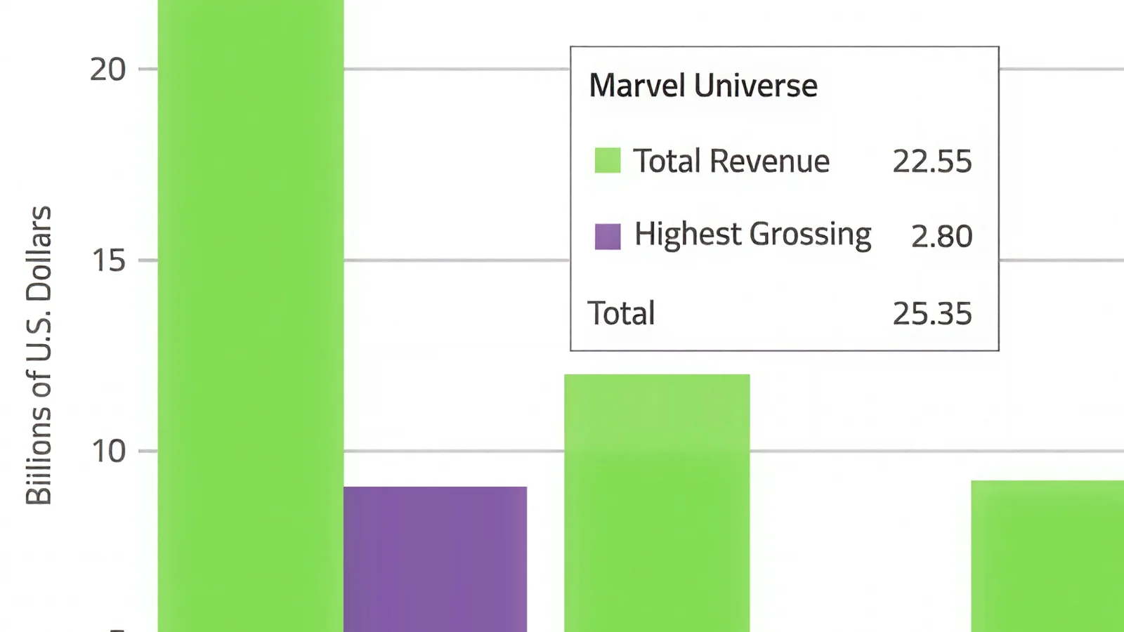
Charts
Vertical categories with grouped, stacked and 100% stacked modes.
Learn more in docs

Charts
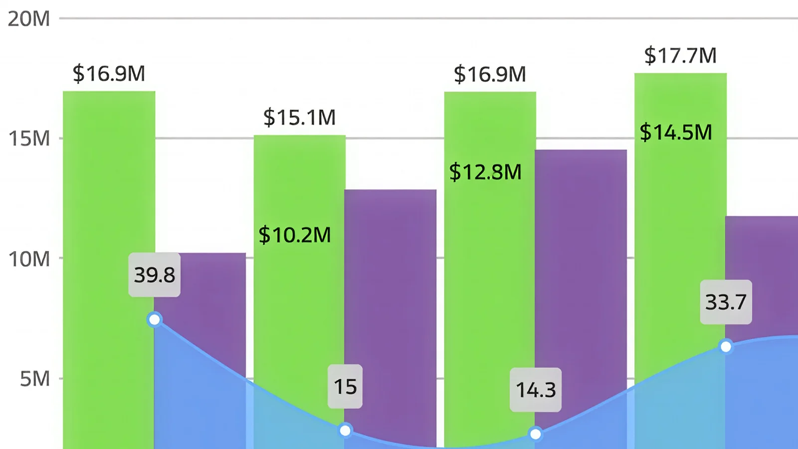
Several series types on shared axes, each with its own scale.
Learn more in docs

Dock Manager
Floating, docked and pinned panes with layout state you can persist.
Learn more in docs
Dock Manager
A broadcast console built from docked panes: preview, activity feed, chat and actions.
Learn more in docs
Open Source
The open-source grid: sorting, filtering, paging and templates, free to ship.
Learn more in docs
Open Source
Paged content with indicators, autoplay and gesture navigation.
Learn more in docs
Open Source
Virtualized item rows with headers, avatars, actions and pan gestures.
Learn more in docs
Open Source
Nested nodes with lazy loading, checkbox selection and keyboard traversal.
Learn more in docs
Open Source
Filterable single or multi-select over local and remote item sources.
Learn more in docsDock Manager
The Ignite UI Dock Manager component provides means to manage the layout of your application through panes, allowing your end-users to customize it further by pinning, resizing, moving and hiding panes.
Get Started for FreeStream Manager
A broadcast console built from docked panes: preview, activity feed, chat and quick actions.

AI coding assistants are only as good as the context they have. Ignite UI's MCP toolchain gives GitHub Copilot, Cursor, Claude Code, and other AI agents live, accurate access to your React component APIs, eliminating hallucinated props, wrong imports, and broken scaffolds.
Give your AI the power to scaffold, configure, and extend your Ignite UI project from the command line. The Ignite UI CLI MCP Server turns natural language prompts into CLI commands, letting agents create components, modules, and project structures that follow enterprise architecture conventions.
Purpose-built instructions that give AI coding assistants the exact component knowledge they need: correct props, import paths, and usage patterns, so agents generate accurate Ignite UI code on the first pass. No prompt engineering required. Works with GitHub Copilot, Cursor, Claude Code, JetBrains AI, and Windsurf out of the box.
Go from a natural language prompt to a production-ready component scaffold in seconds. Ignite UI scaffolding respects your project structure, framework conventions, and design system, so what AI generates is what your team ships, not a starting point for an hour of cleanup.
Ask in plain language. The CLI and MCP server resolve it against live, versioned component APIs, and what lands in your project compiles and matches your design system.
You describe it
In plain language
“Add a claims review screen — filterable table, monthly trend, and Excel export.”IgrGridIgrCategoryChartexcel-export
Works from Copilot, Cursor, Claude Code, JetBrains AI or Windsurf — no special syntax.
MCP grounds it
Against live component APIs
typed4 filesWCAG AA0 fixesIt lands in your project
Themed, accessible, compiling
Open claims
3,418
4.1%
Value
$8.6M
2.4%
Resolved
97.2%
1.2 pts
| Claimant | Value | Status |
|---|---|---|
| Halvorsen Group | $18,240 | Resolved |
| Redwood Mutual | $9,115 | In review |
Refine the prompt and the same loop runs again — only the affected parts change.
Ignite UI’s strength in Excel is truly top-notch... Having features ready for LOB apps and high-quality technical support helped our development.
Hiroshi KuboPrincipal Software Architect, B-EN-G
Case Study
To continue providing customers with cutting-edge technological features, B-EN-G set out to meet the needs of customers wishing to connect to a new range of devices that make up the Internet of Things (IOT).
Read the case studyOpen source
50+ controls ship under the MIT license with no revenue cap, team-size limit or employee count attached. Adopt Ignite UI for React without a procurement cycle, ship it commercially for free, and license only when the application needs the grid, charts or Dock Manager.
50+ production-ready React components under MIT, installed from npm. Free to ship commercially, whatever your revenue or team size.
npm install igniteui-reactView the repo on GitHubEverything in open source, plus the controls enterprise applications are built on and the engineers who maintain them.
$1,399 per developer, per year
See what is includedUpgrading is a package swap, not a rewrite — same APIs, same theming, same design tokens.
Pricing
Per developer, royalty-free. Every subscription includes standard support and every release in its term, with no runtime fees. Multi-year terms cost less per year.
$1,189/ year$1,399
3 year term · per developer, royalty-free subscription
Get a guaranteed response within one business day, faster access to Infragistics engineers and in-depth troubleshooting.
$2,039/ year$2,399
3 year term · per developer, royalty-free subscription
Get a guaranteed response within one business day, faster access to Infragistics engineers and in-depth troubleshooting.
$1,359/ year$1,599
3 year term · per developer, royalty-free subscription
Get a guaranteed response within one business day, faster access to Infragistics engineers and in-depth troubleshooting.
| Best value | |||
| Products included | Ignite UI | Infragistics Ultimate | Infragistics Professional |
|---|---|---|---|
| App Builder | |||
| Angular | |||
| ASP.NET Core | |||
| ASP.NET MVC | |||
| jQuery | |||
| Blazor | |||
| React | |||
| Web Components | |||
| Ultimate UI for ASP.NET Web Forms | |||
| Ultimate UI for Windows Forms | |||
| Ultimate UI for WPF |
Questions and Answers for Ignite UI for React
Ignite UI for React is a complete library of React components for building data-rich and responsive web apps, including 60+ data charts and graphs, data grids and tables, and user interface (UI) components.
The Ignite UI CLI represents a stand-alone command-line tool that helps you build and scaffold applications for numerous frameworks. The CLI tools provide a variety of templates for your project which are pre-configured for the Ignite UI for React toolset. You can also add your own templates to the CLI to accelerate adding components to your projects.
A React component is a class that contains a reusable function which returns a template that includes a piece of user interface represented by HTML, JavaScript and CSS. Examples of React components include complex UI controls like Data Charts or Data Grids, or simple elements like DIV’s with HTML elements.
React does not have specific requirements and ways as to where your components should go or how they should be organized. This is up to developers working on the project. Several approaches: organizing components by Type, where similar elements are systematized in the same place (React components live in a components folder, styles in a styles folder, and so on); by Similarity, which ensures that everything a component needs remains as close to the component as possible; or by Functional Area, placing components by app function, like “Customer” would have all related Customer components for Customer screens/functionality.
Testing React components falls into two general categories: rendering component trees, where a hierarchical tree of React components describes the user interface and encapsulates every aspect of the application that a user sees and interacts with in their browser; and running a complete app in a realistic browser environment, a process referred to as “end-to-end” tests.
Functional components in React are simply JavaScript functions. There is no render method used here. Functional components work by accepting properties (props) as an argument and then return a React element. Class Components represent simple classes, consisting of functions which add functionality to your app. It requires render() method to be implemented here.
Ignite UI for React is the most complete library of enterprise-grade, React UI components available. Professionally designed and developed, Ignite UI for React provides you with everything you need to build modern, progressive web apps. All backed by Infragistics 30+ years of industry leadership and our award-winning live support.
Our React components are included as a part of our Ignite UI bundle. A single developer license starts at $1,399 USD for a one-year subscription, including one year of standard support and updates. We also offer discounts for multi-year licenses. Please refer to our Pricing page for more information on pricing.
The best place to begin is with our Getting Started Documentation.
The team at Infragistics maintains a comprehensive library of React code samples, along with a library of sample applications. Both are linked from the Resources section below.
Component index
Every component ships with API documentation, live samples and theming. A selection of the most used controls:
Resources
Every component carries the same set of resources, so you are never more than two clicks from working React code.
Install the package and every grid, chart, layout and input control is available to your project. The Ignite UI CLI and MCP server can do the same steps from a prompt if your team works with an AI assistant.


