Splitter
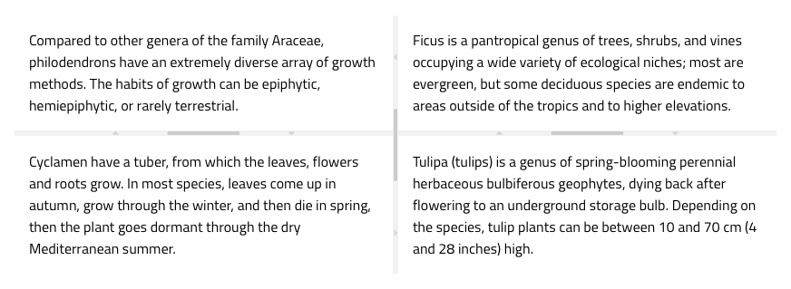
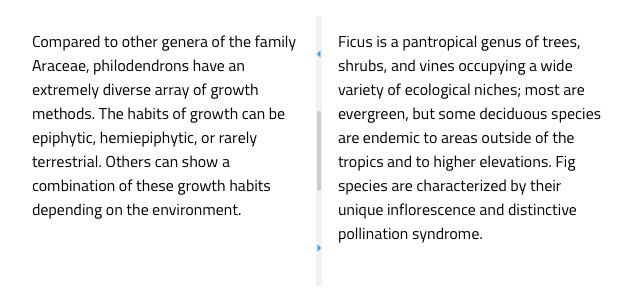
Use the Splitter Component to create dynamic layouts split into vertically or horizontally arranged panes. Panes are separated by the splitter bars that allow dragging to resize or expand/collapse them. The Splitter is visually identical to the Ignite UI for Angular Splitter Component.
Splitter Demo

Orientation
The Splitter supports two orientations: Vertical and Horizontal. The vertical splitter is used to split panes horizontally, and the horizontal splitter is used to split panes vertically.

Nested Panes
The Splitter consists of at least one bar and two panes. The panes are placeholders, and the splitter bar is between them to allow resizing by dragging its handle or expand/collapse by clicking the arrow icons on the bar. You can nest splitter components to create more elaborate layouts in a fashion like it is shown below.

Styling
The Splitter can be styled by changing the color of the icons.

Additional Resources
Related topics:
Our community is active and always welcoming to new ideas.