Slider
Use the Slider Component to allow the user to select a single value or specify a range of values by choosing values for both its ends. The Slider is visually identical to the Ignite UI for Angular Slider Component
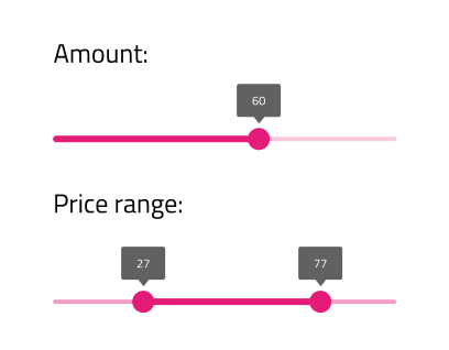
Slider Demo
Type
The Slider allows the user to choose from two types - Continuous and Discrete. In Figma, you can switch between the two using the Type property in the properties panel on the right.
Thumbs
The Slider offers a variant with One thumb for selecting a single value and with Two thumbs for specifying a range. In Figma, you can switch between the two using the Variant property in the properties panel on the right. Further, you can specify the value for the thumbs from the Lower Thumb and Upper Thumb properties or adjust it manually on the thumb label.
State
The Slider supports Enabled and Disabled states, reflecting the possibility to change the value(s). In Figma, you can switch between the two using the Disabled boolean property in the properties panel on the right.


Styling
The Slider comes with styling flexibility through the options available for the label background, thumb, track, and base track colors.

Usage
The Slider track color should always have a higher emphasis than the track base color and both single value and range Sliders should be consistently styled.
| Do | Don't |
|---|---|
 |
 |
 |
 |
Our community is active and always welcoming to new ideas.
 GitHub