Date Picker
Use the Date Picker Component to represent a date visually and provide appropriate means for its display in forms and selection from a dropdown or dialog. The Date Picker is visually identical to the Ignite UI for Angular Date Picker Component
Date Picker Demo
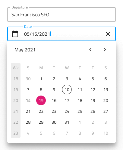
Date Picker Input
You may insert a Date Picker Input in your forms to indicate fields for selecting a date. It supports Enabled and Disabled interactive states, as well as variant for Dialog and Dropdown that will be shown upon user interaction.

Picker Layout
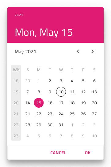
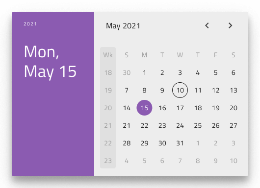
The Date Picker supports a Dialog layout with Horizontal and Vertical orientation, as well as a Dropdown layout to facilitate different modes of picking dates, casting different shadows to be more easily distinguished from each other. Notice that Dialog layouts come with a Header that you may hide in Figma by switching off the boolean Header property and the layout will adjust itself accordingly thanks to the added auto layout.
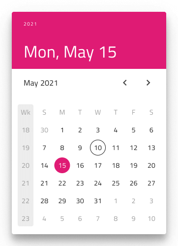
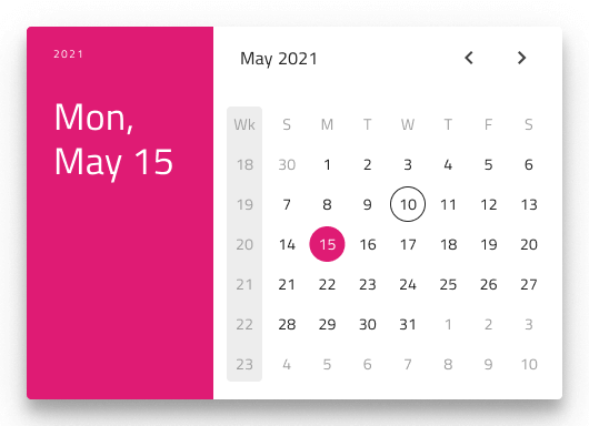

In Figma, you can display action buttons at the bottom of the Date Picker by enabling the Action Buttons boolean property.
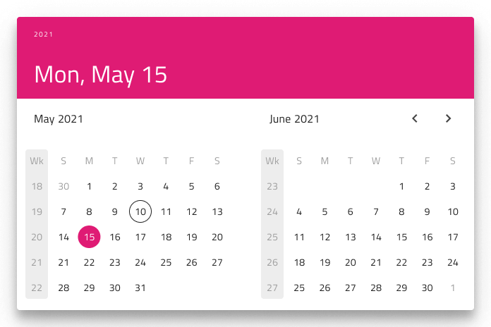
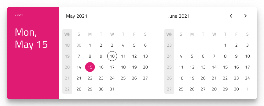
Multiview Variants
The Date Picker includes a Multiview option to display two months side by side. In Figma, you can enable this with the Multiview boolean property and select either horizontal or vertical orientation using the Orientation property.
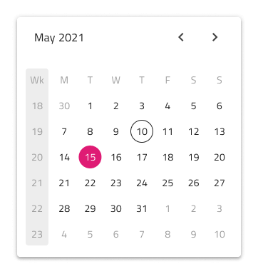
Week Start
We support the two most common scenarios for first day of the week: Sunday and Monday. In Figma you can select the start of the week from the Week Start property.
Week Numbers
The Date Picker has the same built-in support for Week Numbers as the Calendar. If you prefer not to show this part of the UI, simply switch off the boolean Week Numbers property in Figma and the layout will adjust itself accordingly thanks to the added auto layout.
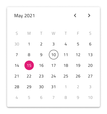
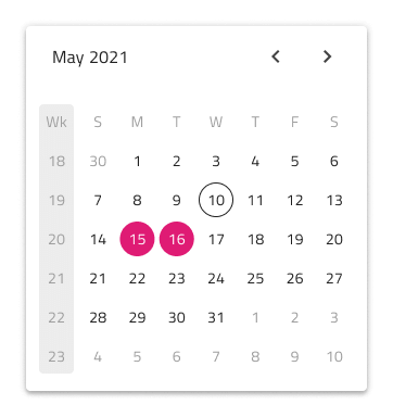
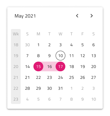
Selection
Akin to the Calendar, the Date Picker lets you pick between three selection modes: Single Day limiting the user to be able to select only one date, Multiple Days allowing selection of random dates, and Range providing means to select all dates between a start and end date.
Styling
The Date Picker comes with styling flexibility through the various options for header background and title colors, as well as text colors for the selected date, current date etc.
Usage
Show the Horizontal and Vertical Dialog Date Pickers as a dialog that dims the rest of the UI.
| Do | Don't |
|---|---|
 |
 |
 |
 |
Additional Resources
Related topics:
Our community is active and always welcoming to new ideas.
 GitHub