Skeleton Card
Use the Skeleton Card Component to layout the same type of information that you would in the standard one, but to also indicate an application state when no data is present at the moment e.g. when data is loaded from a remote data source and there is either lack of connectivity, or it takes some time. The Skeleton Card is just a visual representation of a Card with a known layout, but without any data to show.
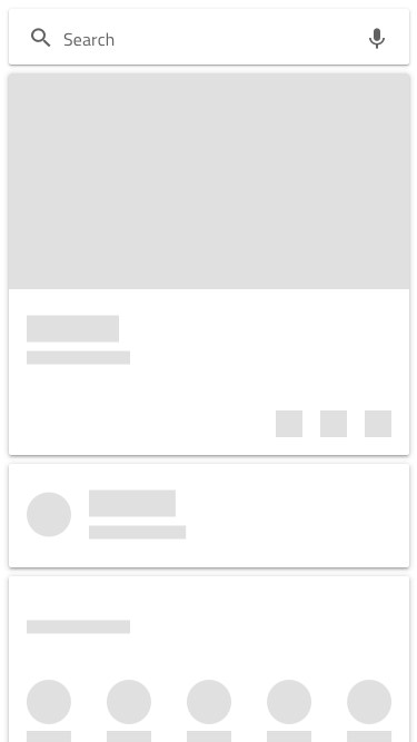
Skeleton Card Demo
Areas
The Skeleton Card supports the same four areas like the standard Card: image, header, content, and actions.
Image
The skeleton image area supports an Image, covering the maps available in the standard Card.

Header
The skeleton header is consistent with that of the standard Card.

Content
The content area supports a Paragraph for a short description text and an Array of shortcuts like Contacts.


Actions
The skeleton actions map to the same layouts that can be found in the standard Card. They are also defined with auto layout in Figma, letting you select the type from the Design tab in the right sidebar.
| Justified Actions Off | Justified Actions On | |
|---|---|---|
| Buttons + Icons |  |
 |
| Icons + Buttons |  |
 |
| Only Buttons |   |
  |
| Only Icons |   |
  |
Skeleton Card Layout
Through the use of an auto layout in Figma, the Skeleton Card can produce various layouts by excluding certain areas or elements to allow the creation of a variety of cards based upon the same Component initially in a similar way like the standard Card does.
Usage
When creating layouts with multiple cards, avoid combining standard and skeleton cards. Data is either present for all cards, or for none of them, thus the two types should not be used within the same grid layout.
| Do | Don't |
|---|---|
 |
 |
Additional Resources
Related topics:
Our community is active and always welcoming to new ideas.
 GitHub