Card
Use the Card Component to display information for a single object through an image, map, or other media content, as well as text, allowing relevant quick actions to be triggered such as sharing, liking, bookmarking, etc. It usually works as an overview and entry point for more detailed information. Cards with various content and layout can be combined to create a dashboard. The Card is visually identical to the Ignite UI for Angular Card Component
Card Demo
Areas
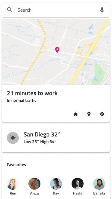
The Card has four distinct areas: image at the top to show picture or map media, header which holds a combination of thumbnail Avatar, Title, and Subtitle, content which holds text paragraphs and an image array detailing the Card, and actions which serve as a toolbar with quick actions related to the Card.
| image |  |
| header |  |
| content |  |
| actions |  |
Image
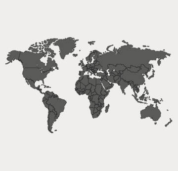
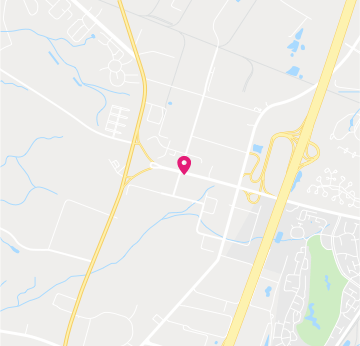
The image area supports collection of nine variants: 6 continent maps for the populated world areas, one World Map, one Navigation Map, and an Image.
Header
The Card header supports various layouts, including an Avatar Thumbnail, Title, and Subtitle elements.
In Figma, the auto layout adjusts the card layout based on the selected properties for the header element from the side panel.
Content
The content supports a Paragraph for a short description text and an Array of shortcuts like Contacts.

Actions
- In Figma, the Card actions come in four different layouts: Buttons+Icons, the inverse Icons+Buttons both containing two Flat buttons and three Icons, and variants with Only Buttons and Only Icons. Every layout has a Justified variant which ensures that the elements are evenly spaced and are built with constraints for responsive behavior. The other four use auto layout for automatic layout adjustments. Additionally, there is a
Content Positionproperty that allows you to define the positions of the Buttons and Icons specifically for the Only Buttons and Only Icons variants.
| Justified Actions Off | Justified Actions On | |
|---|---|---|
| Buttons + Icons | |
 |
| Icons + Buttons |  |
 |
| Only Buttons |   |
  |
| Only Icons |   |
  |
Card Layout
Through the use of auto layout in Figma, the Card can produce various layouts by excluding certain areas or elements within them to support a variety of distinct cards based upon the same Component initially.
Styling
The Card comes with styling flexibility through the various options available for image, header, content, and actions areas such as text styles, icon types, and colors, as well as button colors and the possibility to choose a Card background color.

Usage
The Card usually works as an overview UI and an entry point for more detailed information. Avoid clogging it with too much information and as you create dashboards with it, size and arrange the Cards consistently in order to form a layout grid with equal horizontal and vertical gaps between cards.
| Do | Don't |
|---|---|
 |
 |
 |
 |
Additional Resources
Related topics:
Our community is active and always welcoming to new ideas.
 GitHub