Browse By Tags

  • Bar Chart Rounded Edges?

    We are looking for a way to create Bar Chart with rounded corners from Server Side to export as Byte to Crystal Reports.

    Is there a way to do with your solution from ASP.NET?

    For Example:

  • Bar Chart multiple axes

    I need to impliment the graph from the snippet.  Notice the values for the top 2 bars 3,896,897 and 80. The major gridline value seems to be based on both values. How do I achieve this using Bar Chart?

  • How to Code a Multi Series Chart in Windows Forms

    [youtube] width="560" height="315" src="http://www.youtube.com/embed/jmAxer96TKM" [/youtube]

    In this video we're going to take a look at adding multiple series to a single chart. Essentially, you'll have a chart view, and…

  • Upcoming Webinar: How to Choose the Right Chart for Your Data

    When building out complex data visualizations, it’s easy to get overwhelmed by the virtually endless array of options around how to sort, filter, and display your data. Where do you even start? Check out our upcoming webinar: How to Choose the Right Chart…

  • Should I Choose a Pie Chart or a Bar Chart?

    Imagine you want a chart that shows how some whole is divided up among its constituent parts. Popular convention may tell you to think in terms of a pie chart. As an example, here’s a bare-bones pie chart with only three categories, showing some fictitious…

  • Bar Charts versus Dot Plots

    Bar charts have a distinct advantage over chart forms that require area or angle judgements. That's because the simple perceptual tasks we require for decoding a bar chart - judging lengths and/or position along a scale - are tasks we're good…

  • 7 Do's and Don'ts of DataViz

    As sites like viz.wtf illustrate, there are many ways to create confusing and misleading data visualizations. There are also many common design-choice options that might be considered sub-optimal. This post outlines 7 common “mistakes”, with alternative…

  • It's The Little Things That Matter: Axes, Tick Marks, Tick Labels, and Grid Lines

    General principles

    While the fundamentals of chart design largely concern the accurate and efficient visual representation of data, it is important not to forget the supporting structures - axes, tick marks, tick labels, and grid lines. These should be…

  • Demystifying Box-and-whisker plots — Part 1

    If you browse through a large, printed, newspaper and pick out all the charts you find you'll probably come across some of the following: bar chart, timeseries (line chart), pie chart, donut chart, stacked area chart. You may come across the odd scatter…

  • How to set a Graph from the UltraChartControl

    Hi friends, I have a graph and this show "Data Values" and figures how triangles and circles. Please how Can I remove it.

    Thanks for all.

  • How do you specify the Y2 axis with a DataTable? - NetAdvantage 2010.2 UltraChart

    Hello,

    I'm currently binding an UltraChart (configured to be a LineChart) to a DataTable which contains three columns.  The first column is a DateTime field cast as a string, and the other two are numeric values.  Additionally, I have set SwapRowsAndColumns…

  • UltraChart Binding problems:

    Using:  VS 2008, C#.net

    I am trying to use the UltraChart object to bind to a datatable in code as follows:


    void UpdateQualityChart(object sender, EventArgs e)

    {


       DataTable dt = new DataTable();

       dt = _sqlData.CreateQualityDataSet…

  • Applying UltraDataSource to an UltraChart object

    Hi All,

    I'm using an UltraChart which uses the UltraDataSource of a related UltraGrid as its DataSource.  What I would like to do is rather than have the chart display all the columns in the DataSource I would like to just display a subset of the…

  • Space between point labels and y-axis

    Which property should I use to take out the space between the labels and the y axis? If I modify the extent of the axis it will move along with the labels and the space is kept. 

    Many thanks for your guidance.

  • Control barspacing in bar chart

    I need barspacing to be half of the width of bars in Barchart. When I am trying to assign a value to Barspace it takes integer value and assigning 1 makes the barspace space equal to bar width.

    Please suggest how I can make barspace = 0.5 * Bar width…

  • Bar charts within the grid?

    Good morning,

     Have been given a task to automate and excel rpt sent to upper mgt.

    It contains serveral bar charts within the excel sheets themselves.

    Is this possible to do in the win grid and then have the grid export the data and charts on a worksheet…

  • Is this a bug in UltraChart control?

    I have a bar chart (or a column chart) and I do this:

    OleDbDataAdapter DA = new OleDbDataAdapter(query, connection);
    DataTable DT = new DataTable();
    DA.Fill(DT);

    UltraChart1.Data.DataSource = (object) DT;
    UltraChart1.Data.DataBind();

    My graphic opens…

  • Bar Chart Color

    Hello, In the 2d Bar chart (picture is attached), I want to replace the color coding as such. In the Legend, when value from Actual (represented in Green), is greater than Scheduled (represented in Blue), then the Actual bars should be in Red and…
  • Ultra web chart like scale

    Hi, I am looking for chart like a scale. Plese find the attached image. Is it possible using Ultra web chart? Plesae help
  • 1 row not filling in chart

    I have a chart and when there are multiple rows in the dataset everything works fine. When there is one row in the dataset the labels are what they should be but the barchart does not fill. Is there a reason why this is?


    Here is my code:


    DataTable…

  • Adding reference lines in bar chart

    Hi!

    I'm wondering if it's possible to add reference lines in a bar char? If it's possible, how can I do that? Here an example of what I'm trying to do.

    It must work in line chart too.

    Thank you!

  • DataValue Above Zero Green; DataValue Below Zero Red; How??

    I would like to represent negative data points as color red, and positive data points as color green.
    And I would like to use zero as a dividing line.
    How??
  • Horizontal Barchart

    This is my first post here, hi everybody!

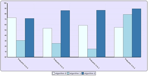
    I successfully implemented a composite chart with a bar chart layer where bars are shown vertically, with their percentage values on the Y axis:

    Now I need to implement a similar chart where bars are shown horizontally…

  • I need hybrid chart of Stacked and Bar chart

    My requirement is to make a chart in which series is having Bars but 2 bars are stacked. Can we achieved it through Infragistics charting. If it is possible then please provide sample of that. I am also attaching snap of desired chart. ---------…
  • Can we fix bar width in scrollable bar chart

    I am using scrollable Bar chart in which showing Scheduled, Actual and remaining effort of employees. When number of employees are increasing then bar width is becomes thinner. I want fix size bars in scrollable bar chart. I am also attaching code and…