Visualizing data instead of presenting them as ASCII in lists or tables makes sense because we’re much better in processing graphical than numerical data (the so-called pictorial superiority effect). Also, graphical visualizations are considered to be…
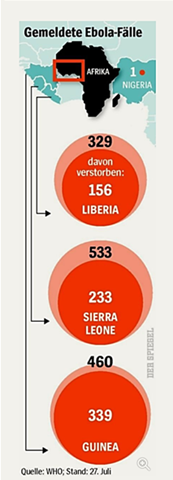
Here’s a cool data viz story. A large weekly magazine in Europe has recently published some statistics about Ebola cases in four African countries. It’s in German, but bear with me here.
Per country, the outer bubble depicts the number of…
As I wrote in an earlier blog, the Infragistics’ UX team was named a 2017 Interaction Design Association’s (IxDA) international awards competition finalist. It was a great honor to have been selected by the judges for our redesign of the complex…
We had a great turnout for the webinar on Dashboard design, thank you for joining! There were so many great questions and comments about User Experience and Design that we could not cover them all during Q&A. Because of this, I’ll address some more here…
There is a lot of data out there today. Spreadsheets upon spreadsheets of data. Presenting this in a meaningful form has, until recently, been the domain of bar charts and line graphs (think MS Excel). This wasn’t necessarily a good thing but at least…
As news outlets become more and more web centric, we see interactive graphics becoming more useful. The upcoming 2012 Presidential election has provided some interesting graphics, and here is a list of my top 5.