
Welcome to Indigo.Design UI Kits
Try NowIndigo.Design System
True UX design-development collaboration becomes easier and time-efficient with Indigo.Design System and App Builder. The Indigo.Design System uniquely combines UI Kits that map to real UI controls and components, with tooling that delivers unprecedented productivity helping digital product teams go from pixel-perfect design to production-ready code. Anything you design can be turned into real, usable code, simplifying the designer-developer handoff like never before.
Accelerate App Creation From Design to Code


 Most popular
- Data Grid
- Line Chart
- List View
- Calendar
 Charts
- Column Chart
- Line Chart
- Spline Chart
- Step Chart
 Gauges
- Bullet Graph
- Linear Gauges
- Radial Gauges
 Styling & themes
- Icons
- Color Palettes
- Typography
- Elevations
- Illustrations
 Grids
Grids
- Data Grid
- Tree Grid
- Hierarchical Grid
- List View
- Combo
 Interactions
- Dialog Window
- Slider
- Tooltip
 Menus
Menus
- Navbar
- Navigation Drawer
 Layouts
- Avatar
- Bottom Navigation
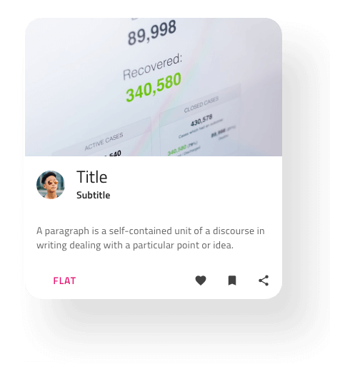
- Card
- Carousel
- Expansion Panel
- Splitter
- Tabs
 Data entry & display
- Badge
- Button
- Button Group
- Checkbox
- Chip
- Divider
- Drop Down
- Icon
- Input
- Progress
- Radio Group
- Select
- Switch
 Notification
- Banner
- Snackbar
- Toast
 Scheduling
- Calendar
- Date Picker
- Time Picker
Why Use Indigo.Design UI Kits?

Backed By Real UI Components
Everything in the Indigo.Design System is backed by UI Kits in the most popular tools like Figma & Sketch, with variants of today's most popular design systems like Material, Fluent & Bootstrap with UI controls in Angular, React, Blazor & Web Components.
Scalable to Your Brand
Apply your brand assets, such as typography and colors, to your own project and libraries. With a few clicks in our Theme plugin, customize UI Components and Patterns so they consistently represent your brand across your projects.

Pixel-Perfect from Start to Finish
As a complete design-to-code solution, you can streamline your entire process. Your digital product team uses the tools they know and love, with no compromise, to take your design into production ready code in a few clicks.
Modern Design
Inspired by the Material Design System, plus Microsoft Fluent, Bootstrap and our own Indigo themed variants, you can design for the most modern app experiences targeting any device. Create simplicity and beauty in no time.

Component-Level Customization
Every component in our UI Kits are built to offer design time flexibility through standard property editors. This means you can focus on design and flows vs. reinventing or recreating custom controls in your designs.


Well-crafted UI Kits for Figma and Sketch
With Indigo.Design UI kits, everything you create uses a design system. All styling specs, including palettes, elevations, typography, display density and themes, match real UI components.
Anything you design with the UI Kits, or simply using the toolbox in App Builder, is fully supported with high-performance, scalable UI Controls in:
- Angular
- React
- Blazor
- Web Components
Plus, you get 400+ icons, special colors palettes, 17 customizable illustrations, and so much more.


Themes to Match Your Brand!
With four different themes, in both dark and light versions, you can accomplish any branding requirement with Indigo.Design. Use what’s included or use any of the themes as a base and customize for the perfect app experience!


Custom Theme Plugin for Sketch
We all love shortcuts. Increase efficiency by implementing the Indigo.Design Plugin for Sketch to your design flow and optimize the theming processes with just a few clicks.

Create Apps Directly from Figma, Sketch and Adobe XD Designs
Go from Design to Code in a single click. Take your designs and craft interactive, responsive apps with real UI components and styling. Use the Indigo.Design plugins directly inside Figma, Sketch and Adobe XD to build apps, with real, production-ready code. Our plugins even deliver custom themes, import images assets, and ensure all components are mapped one-to-one with controls from the App Builder Toolbox.


Responsive
Target any screen size effortlessly with patterns that dynamically grow and shrink, so you can create a genuinely responsive Ul environment and fulfill any demand.
Create a state-of-the-art web application with App Builder Design-to-code story directly from Sketch or Figma, bind it to data in the App Builder, and push the code to GitHub in one integrated workflow that brings designers and developers together like never before.


User Testing
Create interactive prototypes with Indigo.Design and perform remote user testing with real users on any device or platform. Get user insights, simplified collaboration with stakeholders, in-depth analytics on users' behavior, and video and audio recordings of the user testing journey.

Latest Release
What's New in Version 3.6.0
The biggest highlight of this version is full support for Bootstrap, Fluent, and Indigo via a dedicated variant of the UI kit for each of the four main themes of Indigo.Design.
- New components
- New features
- New reference apps
- New states
- Bugs fixed
