
What’s New: Ignite UI for Angular 19.2
Ignite UI for Angular 19.2 is here and it introduces a major update to SSR (Server Side Rendering) and SSG (Prerendering), plus a brand-new component - Angular Tile Manager. Read more about these enhancements.
 Radoslav Mirchev
7 min read
Radoslav Mirchev
7 min read
We are thrilled to announce that the Ignite UI for Angular 19.2 update is here, and we promise it will further improve how you build web applications! It packs two significant enhancements:
- Ignite UI Angular Grid major update of SSR (Server Side Rendering) and SSG (Prerendering)
- Angular Tile Manager
It will not be an egg hunt game to start creating feature-rich and high-performance Angular applications. You just need to run: npm update igniteui-angular.
Let’s explore the updates to see what you can do.
SSR (Server Side Rendering) and SSG (Prerendering) for Ignite UI for Angular Grid
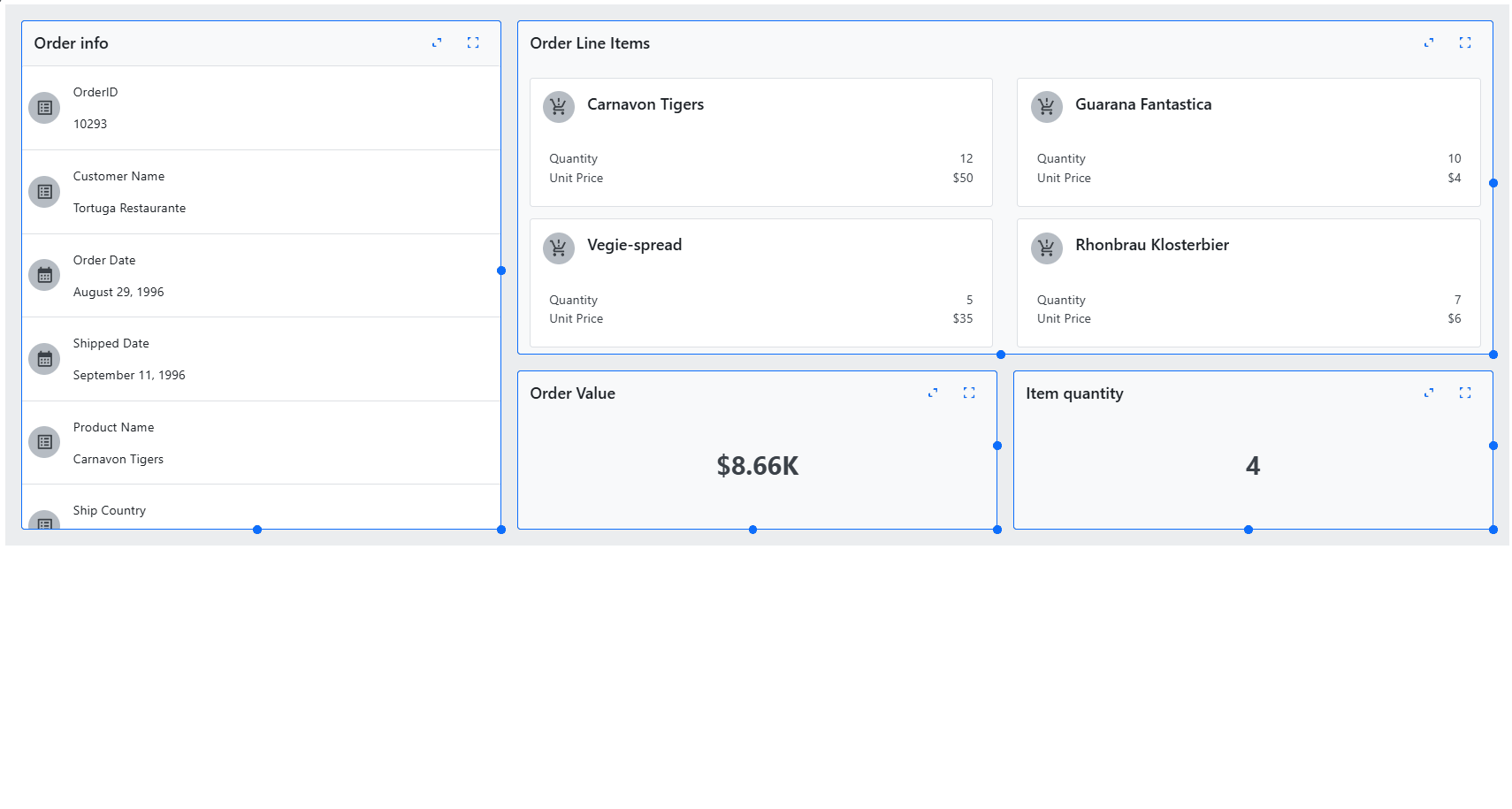
Ignite UI Angular Grid received a major update to its SSR (Server Side Rendering) and SSG (Prerendering). In previous versions, users could experience various side effects during hydration, such as columns and containers changing widths. This was because of virtualization, which required sizes to be calculated. With Ignite UI for Angular 19.2, the grid now renders all its inner elements with their appropriate relative sizes, allowing for seamless client hydration and subsequent data-binding. With these improvements, users should have a better experience, enabling SEO and performance-critical SSG or SSR in Angular.
**NOTE:** Data is only prerendered if all grid sizes are set in pixels.
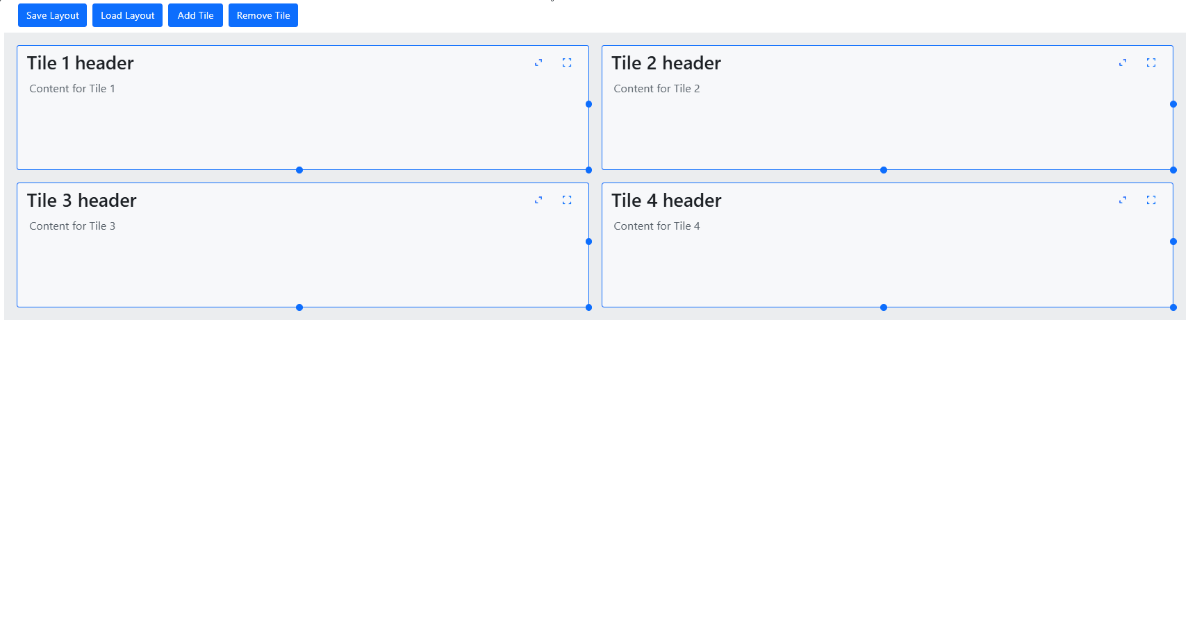
Angular Tile Manager Component
The Tile Manager component enables the display of content in individual tiles. It allows users to interact with these tiles by rearranging and resizing them, giving them the freedom to customize the layout and appearance of the content according to their preferences. This flexibility enhances the user experience by enabling a more personalized and efficient way to view and manage content.
Ignite UI Tile Manager is a standard web component that can be used in an Angular application. It offers two components that we can use:
IgcTileComponent– This component represents an individual tile displayed within the Tile Manager.IgcTileManagerComponent– This is the main component that contains all of the tile components, serving as the container for the entire tile layout.
Properties of the Tile Manager
Columns and Rows
As a user, you can define the number of grid columns for the Tile Manager. To do this, simply set the column-count property to the desired number of columns.
Gap
The Gap property defines the space between tiles. The value of the gap property must be a number followed by a length unit (e.g., px, rem, em, …). This value will apply to both the horizontal gap (width) and the vertical gap (height) between tiles.
Minimum Width and Height
Are properties for setting the minimum width of the columns (min-column-width) and the minimum height of the rows (min-row-height) in the Tile Manager. Similar to the gap property, the values for these properties must be a number followed by a length unit.

Resizing
Resizing in the Tile Manager is a functionality that allows tiles to be resized using three different resize adorners.
- Side Adorner: Adjusts the width by modifying the column span.
- Bottom Adorner: Adjusts the height by modifying the row span.
- Corner Adorner: Adjusts both width and height simultaneously.
Reorder
You can reorder tiles in the Tile Manager using the drag-and-drop feature. By default, tiles are not draggable. To enable this functionality, set the drag-mode property on the Tile Manager to either tile or tile-header.
- With the tile option, you can click and hold anywhere on an individual tile to start dragging it.
- With the tile-header option, you can only click and hold in the tile’s header section to start the dragging process.
Serialization
The Web Components Tile Manager provides methods that help manage the layout of tiles:
- The saveLayout method allows you to save the current arrangement of tiles in the Tile Manager. It captures all tiles’ current order, size, and position so you can restore them to this exact configuration later.
- The loadLayout method enables you to load a previously saved layout. When called, it restores the tiles to their exact state when the layout was saved, including their order, size, and position.
Styling
You can also customize the appearance of the two components – Tile Manager and Tile. The Tile Manager exposes only one CSS property – base, which can be used for styling the base wrapper of the Tile Manager. The Tile component exposes several CSS properties that you can use.
It’s important to note that the Web Components Tile component has properties that can be set individually for each tile. Some of these properties include:
- The
col-spanproperty specifies how many columns the tile will span across in the layout, allowing you to control its horizontal size. - The
row-spanproperty determines how many rows the tile will span vertically, adjusting the tile’s height within the layout. - The
col-startproperty specifies the starting column where the tile is placed. - The
row-startproperty specifies the starting row where the tile is placed. - The
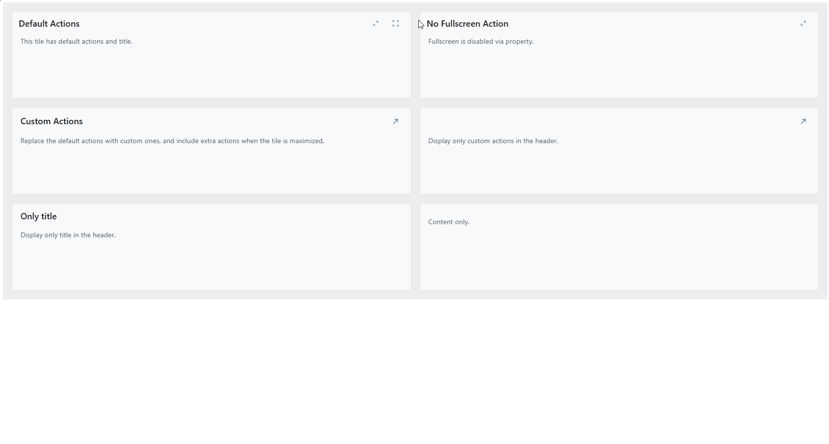
disable-fullscreenproperty hides the default fullscreen action button. - The
disable-maximizeproperty hides the default maximize toggle action button. - The
disable-resizeproperty prevents the tile from being resized by the user.
Ignite UI for Angular 19.2.0 Changelog
Explore all the details here.
General
IgxCarousel- Removed deprecated property
keyboardSupport.
- Removed deprecated property
IgxSlide- Deprecation –
tabIndexhas been deprecated and will be removed in a future version.
- Deprecation –
IgxGrid,IgxHierarchicalGrid,IgxTreeGrid- A column’s
minWidthandmaxWidthconstrain the user-specifiedwidthso that it cannot go outside their bounds. - In SSR mode grid with height 100% or with no height will render on the server with % size and with no data. The grid will show either the empty grid template or the loading indicator (if isLoading is true).
- In SSR mode grid with width 100% or with no width will render on the server with % size and with all columns.
- The
pagingModeproperty can now be set as simple strings'local'and'remote'and does not require importing theGridPagingModeenum.
- A column’s
IgxHierarchicalGrid- Introduced a new advanced filtering capability that enables top-level records to be dynamically refined based on the attributes or data of their associated child records.
- Added a new
schemainput property that can be used to pass collection ofEntityTypeobjects. This property is required for remote data scenarios.
IgxQueryBuilderComponent,IgxAdvancedFilteringDialogComponent- Added support for entities with hierarchical structure.
EntityType- A new optional property called
childEntitieshas been introduced that can be used to create nested entities.
- A new optional property called
To Wrap It All Up…
Seamlessly crafted for compatibility, Ignite UI for Angular is the library that enables you to leverage the power of the latest technologies and major releases. Committed to providing you with the best Angular UI toolkit and related insights, our goal is to equip you with more know-how, new features, enhanced performance, and improved stability. Some of the enhancements were added thanks to the requests from users like yourself through our Ignite UI for Angular GitHub repository. With this in mind, we are always open to suggestions and feedback – it makes us grow and better respond to your development needs.
If you need more details, we encourage you to check out our:

