Blazor Stepper Overview
The Blazor Stepper Component provides a wizard-like workflow and is used for showing progress through numbered steps. It enables developers to divide a lengthy content into a sequence of logical steps, helping end-users more easily navigate the entire process. The Blazor Stepper is displayed as a vertical or a horizontal line. The Blazor Stepper has multiple features like step validation, styling, orientation and keyboard navigation.
Blazor Stepper Example
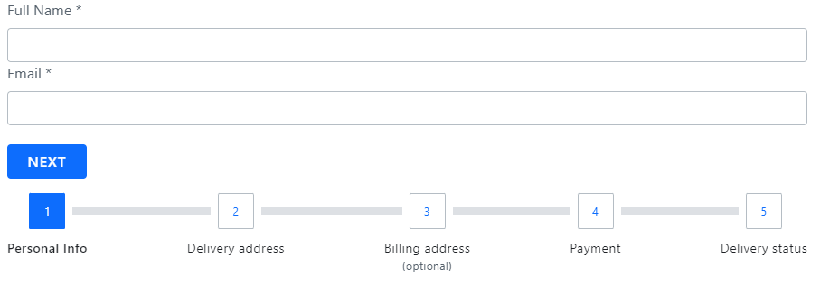
The following Ignite UI for Blazor Stepper Example below shows the component in action. It visualizes the process that an end-user must pass through to configure an order details, following several consecutive steps.
Getting Started with Blazor Stepper
// in Program.cs file

builder.Services.AddIgniteUIBlazor(
    typeof(IgbStepperModule)
);
You will also need to link an additional CSS file to apply the styling to the IgbStepper component. The following needs to be placed in the wwwroot/index.html file in a Blazor Web Assembly project or the Pages/_Host.cshtml file in a Blazor Server project:
<link href="_content/IgniteUI.Blazor/themes/light/bootstrap.css" rel="stylesheet" />
Now you can start with a basic configuration of the Blazor IgbStepper and its steps.
How To Use Blazor Stepper
The IgbStep is the representation of every step that belongs to the IgbStepper. Steps provide Invalid, Active, Optional, Disabled and Complete properties, which give you the ability to configure the step states according to your business requirement.
Declaring Blazor Stepper
Steps can be declared using one of the following approaches.
- Iterating through a data set
<IgbStepper>
    @foreach (var item in this.StepsData)
    {
        <IgbStep Disabled="@item.Disabled">
          <p slot="title">@item.Title</p>
        </IgbStep>
    }
</IgbStepper>
- Creating static steps
<IgbStepper>
    <IgbStep>
       <p slot="title">Step 1</p>
    </IgbStep>
     <IgbStep>
       <p slot="title">Step 2</p>
    </IgbStep>
</IgbStepper>
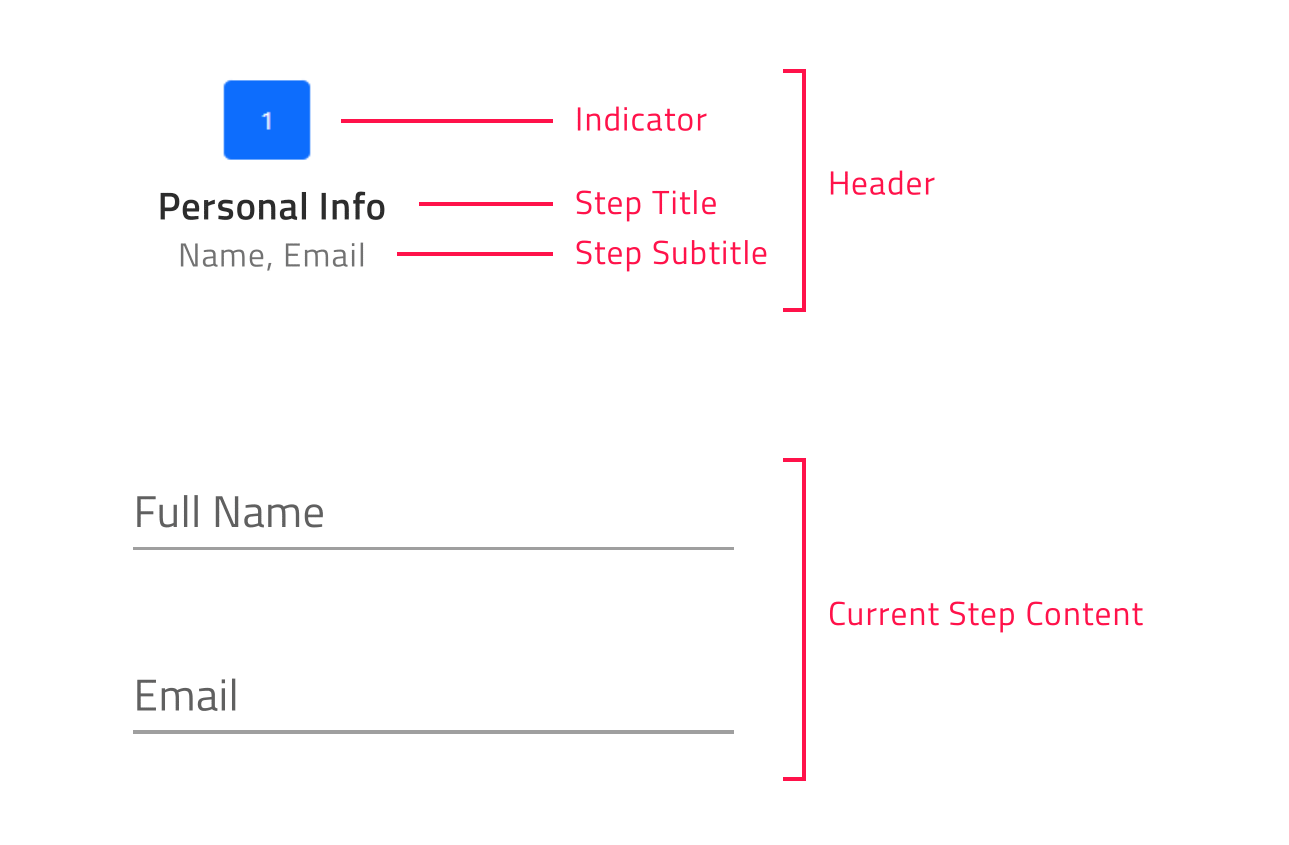
For each step the user has the ability to configure indicator, title and subtitle using the Indicator, Title and Subtitle slots as follows:
[!Note] The
DefaultIgbStepslot renders the content of the step.
<IgbStepper>
    <IgbStep>
       <IgbIcon slot="indicator" IconName="home" Collection="material" />
       <p slot="title">Home</p>
       <p slot="subtitle">Home Sub Title</p>
       <div>
          Step Content
          ...
       </div>
    </IgbStep>
</IgbStepper>
Orientation in Blazor Stepper
You can customize the stepper orientation through the exposed Orientation property. It could be set to horizontal (default value) or vertical.
Horizontal Stepper Orientation
horizontal is the default value for the IgbStepper orientation property.
When the Blazor stepper is horizontally orientated you have the opportunity to determine whether the steps’ content would be displayed above or below the steps’ headers. This could be achieved by setting the IgbStepper ContentTop boolean property, which default value is false. In case it is enabled the steps’ content would be displayed above the steps’ headers.
Vertical Stepper Orientation
You can easily switch from the horizontal to vertical layout. In order to change the default orientation you should set the Orientation property to vertical.
The sample below demonstrates how stepper orientation and titles position could be changed runtime.
Step States
Blazor IgbStepper supports five steps states and each of them apply different styles by default:
- active - Determines whether the step is the currently displayed. By design, if the user does not explicitly set some step’s active attribute to true, the initial active step would be the first non-disabled step.
- disabled - Determines whether the step is intractable. By default, the disabled attribute of a step is set to false.
- invalid - Determines whether the step is valid. Based on its value it is decided whether the user will have the ability to move forward in linear stepper mode. Its default value is false.
- optional - By default, the optional attribute of a step is set to false. If validity of a step in linear stepper is not required, then the optional attribute can be enabled in order to be able to move forward independently from the step validity.
- complete - By default, the complete attribute of a step returns false. The user, however, can override this default complete behavior by setting the complete attribute as needed. When step is marked as complete not only that the style of the step header is changed by default, but also the style of the progress line between the completed step and the next one.
Linear Blazor Stepper
The Blazor IgbStepper gives you the opportunity to set its steps flow using the Linear property. By default, linear is set to false and the user is enabled to select any non-disabled step in the IgbStepper.
<IgbStepper Linear="true">
    <IgbStep>
       <p slot="title">Step 1</p>
    </IgbStep>
     <IgbStep>
       <p slot="title">Step 2</p>
    </IgbStep>
</IgbStepper>
When the linear property is set to true, the stepper will require the current non-optional step to be valid before proceeding to the next one.
If the current non-optional step is not valid you cannot go forward to the next step until you validate the current one.
[!Note] Optional steps validity is not taken into account in order to move forward.
Step Interactions
IgbStepper provides the following API methods for step interactions:
- navigateTo – activates the step by given index.
- next - activates the next non-disabled step.
- prev – activates the previous non-disabled step.
- reset – resets the stepper to its initial state.
[!Note] The reset method would reset the stepper to its initial state, i.e. activates the first step. It would not clear the step`s content. This should be done manually.
Customizing the Steps
The Ignite UI for Blazor Stepper gives you the ability to configure different options for titles, indicators and more.
This could be achieved through the StepType property of the IgbStepper. It takes the following values:
- Full (default value)
- Indicator
- Title
Full
If titles and subtitles are defined, with this setup both indicators and titles would be rendered.
The user would also have the ability to define the position of the title for the steps, so it could be placed before, after, above or below the step indicator.
The user can configure the title position using the TitlePosition property. It takes the following values:
- undefined (default value)
- end
- start
- bottom
- top
When the Blazor IgbStepper is horizontally orientated and the title position is not defined, the titles would be displayed below the indicators.
When the orientation is set to vertical and the title position is not defined, the titles would be displayed after the indicators.
[!Note] titlePosition property is applicable only when the stepper stepType property is set to full.
Indicator
If you want to display only indicators for the steps, set the stepType option to indicator.
The step indicator supports any content, however with the restriction that its size would be always 24 pixels. Having this in mind, we recommend using IgbIcon or IgbAvatar as step indicators.
Title
If you want to display only titles for the steps, set the stepType option to title.
In this way if subtitles are defined, they will also be rendered below the step title.
[!Note] This container could be re-templated as per your requirement without any size restrictions. For example, you could add an indicator with size greater than 24 pixels inside it.
The sample below demonstrates all exposed step types and how they could be changed:
Keyboard Navigation
The Ignite UI for Blazor Stepper provides a rich variety of keyboard interactions to the end-user. This functionality is enabled by default and allows end-users to easily navigate through the steps.
The Blazor IgbStepper navigation is compliant with W3 accessability standards and convenient to use.
Key Combinations
- Tab - moves the focus to the next tabbable element
- Shift + Tab - moves the focus to the previous tabbable element
- ↓ - moves the focus to the header of the next accessible step when the stepper is vertically orientated
- ↑ - moves the focus to the header of the previous accessible step when the stepper is vertically orientated
- ← - moves the focus to the header of the previous accessible step in both orientations
- → - moves the focus to the header of the next accessible step in both orientations
- Home - moves the focus to the header of the FIRST enabled step in the stepper
- End - moves the focus to the header of the LAST enabled step in the stepper
- Enter or Space - activates the currently focused step
Styling Blazor Stepper
You can change the appearance of the IgbSteps, by using some of the exposed CSS parts listed below:
| Part name | Description |
|---|---|
header-container |
Wrapper of the step's header and its separators. |
disabled |
Indicates a disabled state. Applies to header-container. |
complete-start |
Indicates a complete state of the current step. Applies to header-container. |
complete-end |
Indicates a complete state of the previous step. Applies to header-container. |
optional |
Indicates an optional state. Applies to header-container. |
invalid |
Indicates an invalid state. Applies to header-container. |
top |
Indicates that the title should be above the indicator. Applies to header-container. |
bottom |
Indicates that the title should be below the indicator. Applies to header-container. |
start |
Indicates that the title should be before the indicator. Applies to header-container. |
end |
Indicates that the title should be after the indicator. Applies to header-container. |
header |
Wrapper of the step's indicator and text. |
indicator |
The indicator of the step. |
text |
Wrapper of the step's title and subtitle. |
empty |
Indicates that no title and subtitle has been provided to the step. Applies to text. |
title |
The title of the step. |
subtitle |
The subtitle of the step. |
body |
Wrapper of the step's content. |
content |
The steps content. |
Using these CSS parts we can customize thе appearance of the IgbStepper component like this:
igc-step::part(title) {
    background: #351e65;
}

igc-step::part(subtitle) {
    background: #5f4691;
}